이번 포스팅에서는 user의 입력을 받을 때, 가장 흔하게 사용하는 TextInput, TextField에 대해 다뤄보았습니다.
이번에도 역시 응용을 하실 수 있도록 기초가 되는 부분만 간단한 예제로 쉽게 다뤄보았습니다.
Application 작성 방법부터 모르시는 분은 이전 포스팅을 먼저 참고해주세요.
2022.11.03 - [Python] - [PyQt6] Getting Started with QtQuick
TextInput Example
import QtQuick
import QtQuick.Layouts
import QtQuick.Controls
import QtQuick.Controls.Material

ApplicationWindow {
  visible: true
  width: 640
  height: 480
  title: "Example App"

  Material.theme: Material.Dark
  Material.primary: Material.Orange
  Material.accent: Material.Orange

  ColumnLayout {
    anchors.centerIn: parent

    GridLayout {
      columns: 2

      Label {
        text: "ID: "
      }

      TextInput {
        id: idInputID
        width: 20
        color: "Orange"
      }

      Label {
        text: "Password: "
      }

      TextInput {
        id: idInputPW
        width: 20
        color: "Orange"
        maximumLength: 4
        echoMode: TextInput.Password
      }
    }

    Button {
      Layout.alignment: Qt.AlignHCenter
      text: "Submit"
      onClicked: console.log(`ID: ${idInputID.text}, PW: ${idInputPW.text}`)
    }
  }
}
ID와 Password를 입력받고, 버튼을 클릭하면 입력한 내용을 출력하는 간단한 예제입니다.
중요한 것은 width property입니다. 이것을 입력하지 않으면 크기가 0으로 동작하여 focus를 받을 수 없게됩니다.
Password쪽은 echoMode를 설정하여 입력을 숨기도록 하였고, 최대 4글자 까지만 입력할 수 있도록 하였습니다.

예제를 실행해서 확인해보세요.
TextField Example
위의 예제는 hint 제공도 안되고, modern UI 처럼 이쁘지도 않죠.
이를 해결한 새로운 예제를 한 번 보시죠.
TextField {
  id: idInputID
  color: "Orange"
  placeholderText: "Input your ID"
}

TextField {
  id: idInputPW
  color: "Orange"
  maximumLength: 4
  echoMode: TextInput.Password
  placeholderText: "Input your password"
}TextField는 TextInput을 상속받기 때문에 기존 속성을 그대로 이용하실 수 있습니다.
거기에 placeholder를 사용하여 사용자에게 hint를 제공할 수도 있고, 시각적으로도 명확하게 control을 보여주어 UX 측면에서 보다 좋은 사용자 경험을 제공할 수 있습니다.
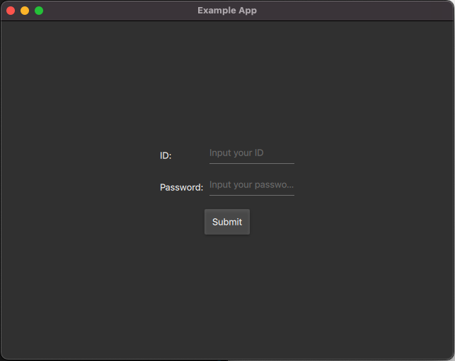


동일한 기능을 제공하지만 어떤 것을 입력해야할 지 힌트도 제공하고, UI로도 확실하게 알려주죠.
그래서 저는 이 type을 주로 사용합니다.
Input Limitation
사용자 입력을 받을 때, 개발자가 원하는 값을 입력하도록 미리 제한을 걸어둘 수 있습니다.
핸드폰 번호, 이메일 주소, 특정 범위 값 입력 등 다양한 용도로 사용이 됩니다.
이를 위해 2가지 방법을 살펴보겠습니다.
먼저, 입력에 masking을 하는 방법입니다.
Label {
  text: "Tel: "
}

TextField {
  id: idInputTel
  color: "Orange"
  placeholderText: "Input your mobile number"
  inputMask: "999-9999-9999"
}
이제 사용자는 총 11자리의 숫자만 입력할 수 있습니다.
좀 더 다양한 내용은 다음의 참고자료를 살펴보세요.
https://doc.qt.io/qt-6/qlineedit.html#inputMask-prop
다음은 validator를 사용하는 방법입니다.
Label {
  text: "Email: "
}

TextField {
  id: idInputEmail
  color: "Orange"
  placeholderText: "Input your e-mail"
  validator: RegularExpressionValidator {
    regularExpression: /[0-9a-zA-Z]+@[a-zA-Z]+\.[a-zA-Z]+/
  }
}
정규표현식을 사용하여 우리가 원하는 값만 입력하도록 제한을 두었습니다.

원하는대로 잘 동작하는 것을 확인하실 수 있습니다.
Wrap Up
사용자 입력을 받기위해 사용하는 TextInput과 TextField에 대해 살펴보았습니다.
기본적인 TextInput, 좀 더 UX측면에서 뛰어난 TextField의 사용과 입력에 제한을 두는 방법도 소개해 드렸습니다.
이번 포스팅도 도움이 되시길 바랍니다.
'Python' 카테고리의 다른 글
| [PyQt6] GroupBox, CheckBox, RadioButton in QML (0) | 2022.11.21 |
|---|---|
| [PyQt6] Dialogs in QML (1) | 2022.11.20 |
| [PyQt6] Drawer in QML (0) | 2022.11.18 |
| [PyQt6] QML file in QML file (0) | 2022.11.14 |
| [PyQt6] Menu in QML (0) | 2022.11.10 |


댓글