matplotlib is used for data visualization in Python.
Especially, this library is lively used in data engineering.
Installation
If you want to locally install this library, you can use pip.
$ pip install matplotlib
I will use Google's Colab for further posting.
Requirements
import numpy as np
import matplotlib.pyplot as plt
from PIL import Image
import cv2
%matplotlib inline
I will use those packages for this posting.
Create Data for Testing
data = np.random.randn(50).cumsum()
hist_data = np.random.randn(100)
scatter_data = np.arange(30)

img1_path = './img1.JPG'
img1_pil = Image.open(img1_path)
img1 = np.array(img1_pil)

img2_path = './img2.JPG'
img2_pil = Image.open(img2_path)
img2 = np.array(img2_pil)
I created 5 data sets.
- Random data set
- Histogram data set
- Scattering data set
- 2 Images
You can use any images.
Now, we are ready to use matplotlib.
Draw Graph
Simple Graph
Let's quickly draw a graph with random data set.
plt.plot(data)
plt.show()
We can simply draw a graph even using two functions plot() and show().
Multiple Graph
# plt.subplot(row, column, index)
plt.subplot(1, 2, 1)
plt.hist(hist_data, bins=20)

plt.subplot(1, 2, 2)
plt.scatter(scatter_data, np.arange(30) + 3 * np.random.randn(30))

plt.show()
We can draw multiple graphs with subplot() function.
hist() function draws histogram, and scatter() function draws scatter graph.
Colorful Graph
plt.subplot(1, 3, 1)
plt.plot(data)

plt.subplot(1, 3, 2)
plt.plot(data, 'r')

plt.subplot(1, 3, 3)
plt.plot(data, 'g')

plt.show()
We can also draw graphs with colors.
Simply give a color argument into the plot() function.
- 'b' - blue
- 'c' - cyan
- 'g' - green
- 'k' - black
- 'r' - red
- 'w' - white
- 'y' - yellow
Graph with Marker
plt.subplot(1, 3, 1)
plt.plot(data, 'o')

plt.subplot(1, 3, 2)
plt.plot(data, 'r+')

plt.subplot(1, 3, 3)
plt.plot(data, 'g^')

plt.show()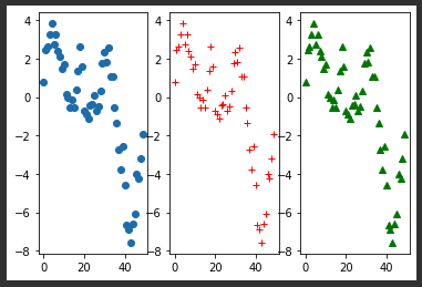
We can draw graphs with markers.
In addition, the marker argument can be used together with the color argument.
- 'o' - circle
- 's' - rectangle
- '^' - triangle
- 'v' - inverted triangle
- '+' - plus
- '-' - dash
- '.' - dot
Graph with Specific Size
# plt.figure(figsize=(width, height))  => Unit of Inch
plt.figure(figsize=(5, 3))
plt.plot(data, 'k+')
plt.show()
We can draw graphs with a specific size that we want using figure() function with figsize argument.
The unit of size is an inch and it means the total size of the graph.
In other words, if you draw multiple graphs, the graphs will share the total size.
This is an example.
plt.figure(figsize=(10, 3))

plt.subplot(1, 2, 1)
plt.hist(hist_data, bins=20)

plt.subplot(1, 2, 2)
plt.scatter(scatter_data, np.arange(30) + 3 * np.random.randn(30))

plt.show()
The total width of graphs is 10 inches, not each graph's width is 10 inches.
Overlapped Multiple Graphs with Legend
plt.figure(figsize=(20, 5))

plt.plot(hist_data, 'r-', drawstyle='steps-post', label='Label1')
plt.plot(hist_data, 'g--', label='Label2')
plt.plot(hist_data, 'bv', label='Label3')

plt.legend()
plt.show()
We can draw overlapped multiple graphs just using the multiple plot() functions.
Furthermore, we can show legend using legend() function.
And each legend can be set by label argument in the plot() function.
Graph with Label
plt.title('Draw Data')
plt.xlabel('This is X axis')
plt.ylabel('This is Y axis')

plt.plot(data)

plt.show()
We can give labels to our graphs.
title() function represents a title of a graph, and xlabel() and ylabel() functions represent a label of x-axis and y-axis of a graph.
Save Graph to File
matplotlib provides the saving feature to us.
So we can save our graphs to the file.
plt.savefig('graph.svg')You can also save to .png or .pdf.
Draw Image
matplotlib can draw images as well.
Histogram of Image
plt.hist(img1.ravel(), 256, [0, 256])
plt.show()
You just need to give an image to hist() function instead of the data.
Simple Image
plt.imshow(img1)
plt.show()
Simply use imshow() function.
Color Scale Image
img_bw_pil = Image.open(img1_path).convert('L')
img_bw = np.array(img_bw_pil)

plt.figure(figsize=(15, 3))

plt.subplot(141)
plt.imshow(img_bw)

plt.subplot(142)
plt.imshow(img_bw, 'gray')

plt.subplot(143)
plt.imshow(img_bw, 'RdBu')

plt.subplot(144)
plt.imshow(img_bw, 'jet')

plt.show()
To implement this, I used the PIL (Python Imaging Library).
Once convert the image data, we just call imshow() function with colormap argument.
Image with Colorbar
plt.title('Image 1')

plt.imshow(img_bw, 'jet')

plt.colorbar()
plt.show()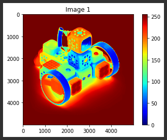
After converting images like the above color scale example, we can add a colorbar to the image.
Simple use colorbar() function.
Overlapped Image
img1_convert = cv2.resize(img1, (400, 400))
img2_convert = cv2.resize(img2, (400, 400))

plt.imshow(img1_convert)
plt.imshow(img2_convert, alpha=0.5)

plt.show()
I used OpenCV to resize images. I resized two images to the same size with this.
We can draw a transparent image using alpha argument in imshow() function.
Same as the graph case, we can draw overlapped images using multiple imshow() functions.
'Python' 카테고리의 다른 글
| [Flask] Using Markdown on Flask (0) | 2021.03.01 |
|---|---|
| [Flask] Send Email on Flask using Flask-Mail (0) | 2021.02.28 |
| [Python] Introduce to DearPyGui (1) | 2021.02.11 |
| [Python] argparse module (0) | 2021.02.03 |
| [Python] Non-Keyword Arguments and Keyword Arguments (0) | 2021.01.22 |


댓글