Grid layout enables an author to align elements into columns and rows.
Sometimes flexbox is hard to construct the layout we want.
If you use a gridbox, you can easily make a layout like a table.
Let's make a default code.
<div class="container">
  <div class="box red">1</div>
  <div class="box yellow">2</div>
  <div class="box green">3</div>
  <div class="box blue">4</div>
  <div class="box purple">5</div>
</div>
.container {
width: 600px;
height: 600px;
border: 3px solid black;
display: grid;
}
.box {
width: 100px;
height: 100px;
font-size: 30px;
display: flex;
justify-content: center;
align-items: center;
}
.red {
background-color: tomato;
}
.yellow {
background-color: goldenrod;
}
.green {
background-color: teal;
}
.blue {
background-color: steelblue;
}
.purple {
background-color: slateblue;
}
The most important thing is display: grid;.
Now, let's start.
Axis
The axis is important because boxes aligned along the axis. There are two axes of a grid layout.
Block Axis
The block axis or column axis is a vertical axis.
Inline Axis
The inline axis or row axis is a horizontal axis.
Template
The grid-template-rows property defines the line names and track sizing functions of the grid rows.
.container {
  ...
  grid-template-rows: 100px 150px 50px 130px 70px;
 }

 .box {
   ...
   /*height: 100px */
 }
The grid-template-columns property defines the line names and track sizing functions of the grid columns.
.container {
  ...
  grid-template-columns: 100px 150px 80px;
}

.box {
  ...
  /* width: 100px */
}
The grid-template-columns property is prior to grid-template-rows, so it applied first.
The example code has 3 column value so the result has 3 columns in a row, and the remaining box moves to the next row.
The grid-column-gap property sets the size of the gap between an element's columns.
The grid-row-gap property sets the size of the gap between an elements' grid rows.
.container {
  ...
  grid-template-columns: repeat(3, 100px);
  grid-template-rows: 100px 100px;
  grid-column-gap: 10px;
  grid-row-gap: 20px;
}

.box {
  ...
  /* width: 100px; */
  /* height: 100px; */
}
The grid-template-areas property specifies named grid areas, establishing the cells in the grid and assigning them names.
The grid-area property specifies a name to grid areas.
.container {
  ...
  grid-template-columns: repeat(2, auto) 100px;
  grid-template-rows: repeat(2, 40px) auto 40px;
  grid-template-areas:
    "header header header"
    "nav nav nav"
    "section section aside"
    "footer footer footer";
}

.box {
  ...
  /* width: 100px; */
  /* height: 100px; */
}

.red {
  ...
  grid-area: header;
}

.yellow {
  ...
  grid-area: nav;
}

.green {
  ...
  grid-area: section;
}

.blue {
  ...
  grid-area: aside;
}

.purple {
  ...
  grid-area: footer;
}
Isn't it awesome? Look at this, how easy to make a layout.
Row and Column
The grid-row-start property specifies a grid item's start position within the grid row by contributing a line, a span, or nothing to its grid placement, thereby specifying the inline-start edge of its grid area.
The grid-row-end property specifies a grid item's end position within the grid row by contributing a line, a span, or nothing to its grid placement, thereby specifying the inline-end edge of its grid area.
The grid-column-start property specifies a grid item's start position within the grid column by contributing a line, a span, or nothing to its grid placement, thereby specifying the block-start edge of its grid area.
The grid-column-end property specifies a grid item's end position within the grid column by contributing a line, a span, or nothing to its grid placement, thereby specifying the block-end edge of its grid area.
.container {
  ...
  grid-template-columns: repeat(4, 100px);
  grid-template-rows: repeat(4, 100px);
}

.box {
  ...
  /* width: 100px; */
  /* height: 100px; */
}

.red {
  ...
  grid-row-start: 1;
  grid-row-end: 2;
  grid-column-start: 1;
  grid-column-end: 3;
}

.yellow {
  ...
  grid-row-start: 1;
  grid-row-end: 2;
  grid-column-start: 3;
  grid-column-end: 5;
}

.green {
  ...
  grid-row-start: 2;
  grid-row-end: 4;
  grid-column-start: 1;
  grid-column-end: 2;
}

.blue {
  ...
  grid-row-start: 2;
  grid-row-end: 4;
  grid-column-start: 2;
  grid-column-end: 5;
}

.purple {
  ...
  grid-row-start: 4;
  grid-row-end: 5;
  grid-column-start: 1;
  grid-column-end: 5;
}
You can input the beginning and end of each row and column for each box.
Automatic Layout
The grid-auto-rows property specifies the size of an implicitly-created grid row track or pattern of tracks.
.container {
  ...
  grid-template-columns: repeat(2, 100px);
  grid-auto-rows: 100px;
}

.box {
  ...
  /* width: 100px; */
  /* height: 100px; */
}
The grid-auto-flow property controls how the auto-placement algorithm works, specifying exactly how auto-placed items get flowed into the grid.
The grid-auto-columns property specifies the size of an implicitly-created grid column track or pattern of tracks.
.container {
  ...
  grid-template-rows: repeat(2, 100px);
  grid-auto-flow: column;
  grid-auto-columns: 100px;
}

.box {
  ...
  /* width: 100px; */
  /* height: 100px; */
}
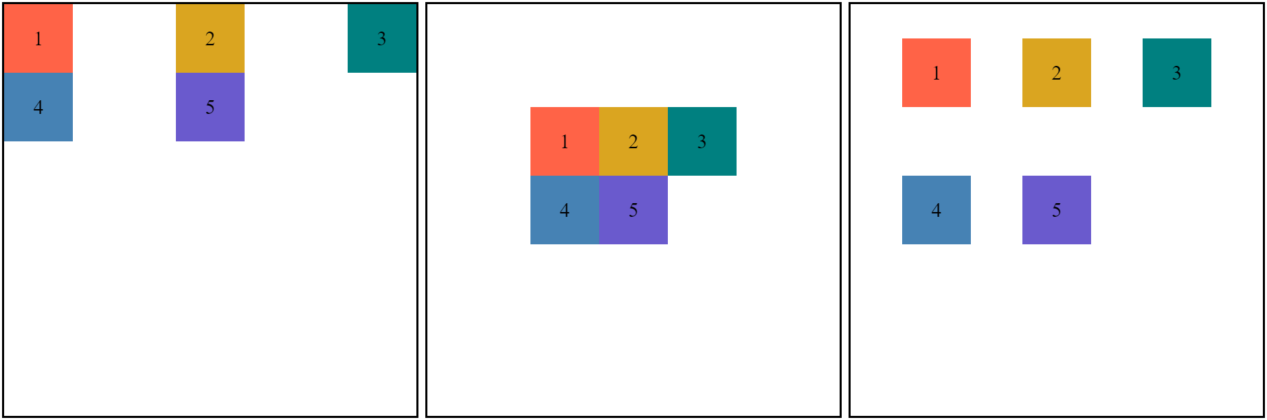
Alignment
The justify-items property defines the default justify-self for all items of the box, giving them all a default way of justifying each box along the appropriate axis.
.container {
  ...
  grid-template-columns: repeat(3, 1fr);
  grid-template-rows: repeat(3, 1fr);
  justify-items: start / center / end;
}

.box {
  ...
  /* width: 100px; */
  /* height: 100px; */
}
The align-items property sets the align-self value on all direct children as a group.
.container {
  ...
  grid-template-columns: repeat(3, 1fr);
  grid-template-rows: repeat(3, 1fr);
  align-items: start / center / end;
}

.box {
  ...
  /* width: 100px; */
  /* height: 100px; */
}
The justify-content property defines how the browser distributes space between and around content items along the inline-axis of a grid container.
.container {
  ...
  grid-template-columns: repeat(3, 100px);
  grid-template-rows: repeat(3, 100px);
  justify-content:
    start / center / end /
    space-around / space-between / space-evenly;
}

.box {
  ...
  /* width: 100px; */
  /* height: 100px; */
}

The align-content property sets the distribution of space between and around content items along a block-axis.
.container {
  ...
  grid-template-columns: repeat(3, 100px);
  grid-template-rows: repeat(3, 100px);
  align-content:
    start / center / end /
    space-around / space-between / space-evenly;
}

.box {
  ...
  /* width: 100px; */
  /* height: 100px; */
}
You can see the bottom space. That's because a 3x3 grid is aligned whole.

Sizing
The minmax() function defines a size range greater than or equal to min and less than or equal to max. It is used with grid layout.
minmax(min, max)
.container {
  ...
  grid-template-columns: repeat(3, minmax(50px, 100px));
  grid-template-rows: repeat(3, minmax(50px, 100px));
}

.box {
  ...
  /* width: 100px; */
  /* height: 100px; */
}
Try to reduce and expand the browser, and see the box sizes. It shrinks or expands to the size we set.
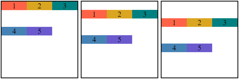
This time I'll show you auto-fill and auto-fit.
.container {
  ...
  grid-template-columns: repeat(auto-fill / auto-fit, minmax(50px, 1fr));
}

.box {
  ...
  /* width: 100px; */
}
Try to resize the browser.
auto-fill fills automatically as long as it can place the size of the box.
auto-fit automatically fits a container by resizing the boxes.
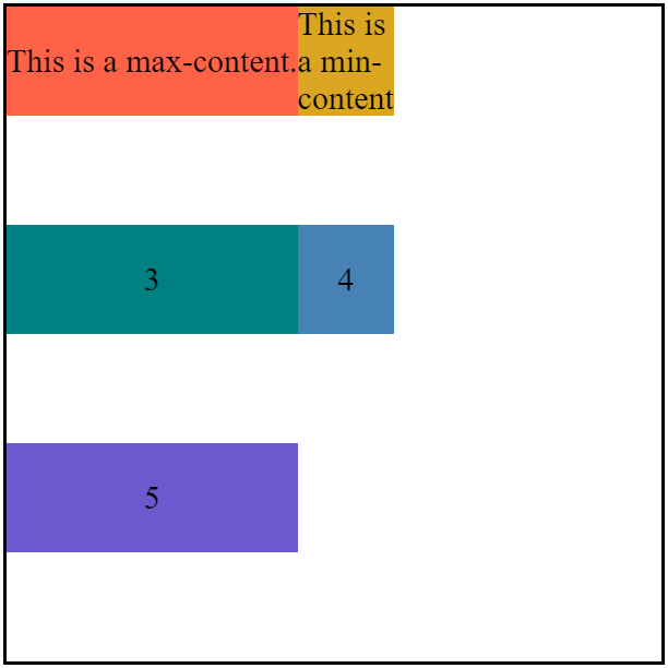
Now, we will find out about min-content and max-content.
<div class="container">
  <div class="box red">This is a max-content.</div>
  <div class="box yellow">This is a min-content.</div>
  ...
</div>
.container {
...
grid-template-columns: max-content min-content;
}
.box {
...
/* width: 100px; */
}The min-content resizes the box to fit the minimum size of the contents of the columns.
The max-content resizes the box to fit the maximum size of the contents of the columns.
Shorthand Property
The grid-gap property sets the gaps between rows and columns.
grid-gap: <grid-row-gap & grid-column-gap>
grid-gap: <grid-row-gap> <grid-column-gap>
.container {
  ...
  grid-template-columns: 100px 100px 100px;
  grid-template-rows: 100px 100px;
  grid-gap: 30px / 30px 60px;
}

.box {
  ...
  /* width: 100px; */
  /* height: 100px; */
}
The grid-row property specifies a grid item's size and location within a grid row by contributing a line, a span, or nothing to its grid placement, thereby specifying the inline-start and inline-end edge of its grid area.
The grid-column property specifies a grid item's size and location within a grid column by contributing a line, a span, or nothing to its grid placement, thereby specifying the block-start and block-end edge of its grid area.
Simply, the grid-row property is a shorthand property of the grid-row-start/end and the grid-column property is a shorthand property of the grid-column-start/end.
grid-row: <grid-row-start> / <grid-row-end>
grid-column: <grid-column-start> / <grid-column-end>
.container {
  ...
  grid-template-columns: repeat(4, 1fr);
  grid-template-rows: repeat(4, 1fr);
  grid-gap: 10px;
}

.box {
  ...
  /* width: 100px; */
  /* height: 100px; */
}

.red {
  ...
  grid-column: span 4;
}

.yellow {
  ...
  grid-row: 2 / 4;
  grid-column: 1 / 2;
}

.green {
  ...
  grid-row: 2 / 4;
  grid-column: 2 / 4;
}

.blue {
  ...
  grid-row: 2 / 4;
  grid-column: 4 / 5;
}

.purple {
  ...
  grid-column: span 4;
}
The place-items property allows you to align items along both the block and inline directions at once in a relevant layout system. If the second value is not set, the first value is also used for it.
place-items: <align-items & justify-items>
place-items: <align-items> <justify-items>
.container {
  ...
  grid-template-columns: repeat(3, 1fr);
  grid-template-rows: repeat(3, 1fr);
  place-items: start center / center start / end;
}

.box {
  ...
  /* width: 100px; */
  /* height: 100px; */
}
The place-content property allows you to align content along both the block and inline directions at once in a relevant layout system.
place-content: <align-content & justify-content>
place-content: <align-content> <justify-content>
.container {
  ...
  grid-template-columns: repeat(3, 100px);
  grid-template-rows: repeat(3, 100px);
  place-content: start space-between / center / space-around space-evenly;
}

.box {
  ...
  /* width: 100px; */
  /* height: 100px; */
}
'Web > CSS' 카테고리의 다른 글
| [CSS] Specificity (0) | 2021.12.07 |
|---|---|
| [CSS] SASS/SCSS (1) | 2020.09.06 |
| [CSS] Margin / Border / Padding (0) | 2020.08.30 |
| [CSS] Flexbox (0) | 2020.08.28 |
| [CSS] BEM (Block Element Modifier) (0) | 2020.08.28 |


댓글